Rough Draft
So, a week or so ago I got a rough draft of the CaseDetective for FogBugz icon to review from Jordan Langille at BuyIcons.com, here it is:
As you can see, all the elements from the original sketch are there, the Trilby which imparts the idea of “detective” is there sitting on the stack of cases. I thought it was superb, had just the right style and texture.
But, I had a few little niggles:
- I thought the hat itself somehow wasn’t quite right. The right hand side of it as you look at it wasn’t defined enough, didn’t stick up enough as I (rightly or wrongly) thought it should.
- The join on the ribbon was a little rough, although it was nice and subtle I just didn’t like the black square. I loved that there was a join, just not the black square.
- But, the most important problem in my eyes was that the icon was not square, so didn’t sit well alongside other icons when I tried it out.
I talked to Jordan about my opinions and he was more than happy to put a bit more definition into the hat and do something else with the ribbon join to make it a little more of a feature. Jordan was also already aware of the icon not being square, and was already set to change that. It was after all a rough draft to check that it was going in the right direction, which it most definitely was.
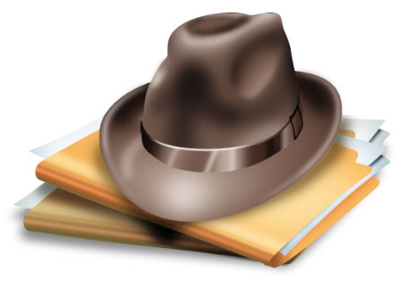
The Final Icon
A couple of days later Jordan sent a little message “Hey Ian, I think this might be it ![]() ) Let me know how it looks.” with the following attached:
) Let me know how it looks.” with the following attached:

My response? “I believe you’re right! Please wrap it up and send me the final files.”
Jordan’s addressed all my little niggles.
- The hat has a much more solid appearance on the right hand side, making it much easier to see when it’s scaled down.
- The ribbon now joins with a nice little gold buckle, which although may not be something you’ll see all that often in the real world, I think it ties into the colour of the folders nicely.
- And adding a folder to the stack instantly relieves the problem I had with the icon not being square. I think it adds a little more chaos to the stack, which I like, almost looks like it might topple over, ‘cos without CaseDetective you just can’t control all your cases as easily!

Conclusion
All in all the process of getting my CaseDetective for FogBugz icon designed was much easier than I expected. Leaving all the design work to the professionals has in my opinion paid off, the icon is distinctive and works well at all the sizes I’ll need to use it (16×16 up to 128×128 and beyond).
Jordan has not only delivered on his promise of “the icon of your dreams” but also really held my newbie hand throughout the process, he’s a really nice guy and I’ll be putting some more work his way that’s for sure.
Now I just need to stop fiddling about with the final few features of the application and get it out to the beta testers!

I really like it.
What is this ribbon that you are talking about, the hat’s ribbon? I can see no buckle.
Posted by Ayende Rahien on July 10th, 2005.
Hi Ayende,
The buckle is still quite subtle, you can only just see it on the hat’s ribbon, on the right hand side. If you click on the image you’ll get a larger sized view of the icon where you can see it much clearer.
It’s really just a little gold square, brings a little of the folder’s colour up onto the hat.
Posted by ianmjones on July 10th, 2005.
Hi! This is a really cool icon. Good work from Jordan. I wonder how it looks in smaller sizes… e.g. 16×16… is it the same icon scaled down or a different icon? (e.g. only the hat)
Do you mind also posting the 16×16 icon. Although I guess we may see it soon enough as a favicon for the website
Posted by Dimitris Giannitsaros on July 10th, 2005.
Hi Dimitris,
The 16×16 is the same as the full sized version in that it still has the hat and folders. It is a little, how should I put it, challenging to tell exactly what the brown blob is and the gold stuff under it if you don’t know what CaseDetective is though! But it does still work, as it’s quite distinctive, having brown in an icon helps it stand out from the crowd, how often do you see icons with a good swathe of brown! Maybe it’ll intrigue people to seek out the full sized version?!
Hmm, beat me to it about the favicon, I sure do intend to set my favicon to be the CaseDetective icon, I’ll try and get that done within a couple of days. I intended to do that for this article but plain forgot. Should have stuck that into FogBugz, then I wouldn’t have forgotten!
Posted by ianmjones on July 11th, 2005.
Tada! I now have a favicon on this site!
Thanks to http://www.html-kit.com/favicon/ it was a no-brainer.
I’ll update the actual CaseDetective website tonight, can’t do it until I get back to the office.
Posted by ianmjones on July 11th, 2005.
OK, strike the html-kit.com favicon maker, it insisted on making nasty 32×32 versions of the icon, and the version with transparency was always the wrong way round, e.g. the 32×32 version came before the 16×16 version, which ain’t right.
So, I rolled my own by grabbing the “ICO (Windows Icon)” file format plugin for Photoshop from http://www.telegraphics.com.au/sw/ and using the 16×16 element from the .icns file Jordan gave me.
At least now transparency works properly, there shouldn’t be a nasty white square around the favicon any longer.
Posted by ianmjones on July 11th, 2005.
The final icon looks terrific. I like the stack of messy folders alot. Congratulations!
Posted by Jon Trainer on July 12th, 2005.
Really cool looking icon, Ian it will make all the difference to Case Detective’s imij.
Posted by Gordon Robertson on July 12th, 2005.
Thanks for the nice comments guys, I must say I think it’s pretty darn cool too!
Cheers.
Posted by ianmjones on July 12th, 2005.