Posts from June 2005.

Climbing the ladder of value or just inflation?

I was just about to trash the copy of my invoice that I referenced in my last post when I noticed the rate I was charging back in 1998. It was only a few pence over half my current rate now, and coincidentally I’m back working for the same client as then. I wonder, have I climbed the ladder and am that much more valuable to my client, or is it just the effects of inflation?

My super inflated ego votes for value, but it’s probably just inflation.

A gateway to better software

My friend Gordon was checking out my business site the other day and noticed my tagline, “A gateway to better software”. His comment: “very grown up and professional :) ”.

The funny thing is, I’ve always used this tag line, my very first invoice after setting up the company back in 1998 had it as part of the logo:

Logo1998.jpg

The logo came from playing with WordArt in Microsoft Office 95, I liked the shape and the tagline just came naturally.

But for some reason I’ve never used this slogan on my website (I’ve checked the Way Back Machine to make sure), I have absolutely no idea why, even though I’ve been a software developer from the start and used it on most of my business stationary (it’s actually AWOL on my current very boring stationary). Weird.

I guess the tagline is more apt now, as the application I’m writing is for people who for the most part will be developing software themselves and using FogBugz to track feature requests, bugs and inquiries. People use a product such as FogBugz if they want to improve their software, and I want to help these people get more out of FogBugz.

Hopefully now I’ll be a gateway to more “better software” than I ever imagined.

Killing two birds with one stone!

Ian Landsman reminds us that we should comment on other peoples’ sites to gain readers, so… nice plan MakeMacGames, good luck, hope you have as much fun in your new venture as I’m having!

Seriously though, really do hope Jon succeeds in his quest to bring a few more native games to the Mac, no matter what anyone says there is a dearth of good stuff. The games ported from Windows are generally hampered by having been optimized for that platform, and therefore generally don’t run as well as they could.

Good luck Jon.

iTunes 4.9: Podcasts == Good, No convert to AAC == Bad

iTunes 4.9 with the new Podcast feature is great, and working well for me except for two things:

1) I don’t like the fact that it doesn’t have the option to automatically convert the downloaded files to bookmark-able AAC files like iPodderX does. This means you can’t “round trip” from iTunes and your iPod.

2) My Smart Playlists can’t reference the Podcast genre files downloaded within the Podcasts list while in iTunes, but they do work on my iPod. Very strange.

Shame, maybe the next version will have these features / fixes.

Search For Identity Part 2 – The Sketch

So, in the first part of this trilogy of posts I briefly described my initial ideas for CaseDetective for FogBugz’s application icon, thus revealing how incompetent I am as a graphics designer! My quest then begun for a professional designer and ended with Jordan Langille at buyicons.com.

After Jordan and I had exchanged a few emails and Jordan had some idea of what CaseDetective for FogBugz was supposed to be all about, Jordan agreed to come back a few days later with an initial sketch of his idea for the application icon for me to review. This is what I received a few days later:

CaseDetective Icon Sketch

My verdict? I love it! I think this icon shows Jordan’s experience, the concept is simple and distinctive with bold elements that I believe will scale well.

The trilby is very iconic (pun intended), it is instantly identifiable with Private Detectives of days gone by, my favourite being Humphrey Bogart in The Maltese Falcon. And if you don’t think of Private Detectives, then you probably think of Police Detectives of a similar time.
The hat is sitting on a couple of paper stuffed folders, the “cases” to be investigated. Again, I think this works well, most people would instantly associate those folders with being the cases that the detective is working on, and for various reasons (to be revealed at a later date) those folders have quite a significance to CaseDetective too.

Jordan and I have since chatted about the colouring of the hat and folders, and I also mentioned that I’d like the hat to be a more diagonal (just pointing to the left a little) as I feel it’s a little straight on in his sketch. I haven’t however dictated the colours, I’m leaving that to the professional designer, I’ve got full confidence in his eye for design and colour coordination, if I hadn’t, I wouldn’t have commissioned him in the first place!

So, while Jordan is off creating the final CaseDetective for FogBugz icon, what do you all think, does it say “CaseDetective” to you as much as it does me?

Search For Identity Part 1

At a certain time in any new applications life there comes a point when it needs to find a visual identity for itself, much in the same way that most people dress in a certain way consciously (or subconsciously) to portray who they feel they are. So it is with CaseDetective for FogBugz.

I’ve had a few ideas for the icon of course, things like a deerstalker hat with a spy glass over a bug or something, or perhaps a beaten up old leather suit case with a spy glass or deerstalker or P.I’s badge next it (Case – Detective, get it?), maybe the case could have stickers on which look like bugs, letters (mail = enquiries) or light bulbs etc. But as you can see, they were all pretty lame!

So, I admit:
I am not a graphic designer, never have been, never will be.

I am also not an artist, never have been, never will be.

But I do need a well designed and executed icon for CaseDetective.

But how do you find the right person to design your application icon?

A little way into my development of CaseDetective I needed some icons for the toolbar, but as this is a cross-platform application I did not want anything too Windows like or too OS X like (the two platforms I’m initially targeting). So after seeing a couple of posts in the ASP forums and the RealBasic NUG mailing list that mentioned they were good I swung by buyicons.com to have a look. They had just the right style for my application, fairly OS X like but not so much that Windows users should get upset, so I bought both icon box sets.

When I bought those icons for my toolbar Jordan Langille at buyicons sent them off to me in a friendly email, and casually mentioned that he’d do me a deal on designing an application icon if I needed one. I didn’t think too much of that at the time, but I had of course already looked at his portfolio and very much liked what I saw, so filed that offer off for later consideration. I wasn’t ready to buy an application icon at the time, in fact it’s a good job I didn’t because it wasn’t too long until I changed the name from the original guiBUGZ to CaseDetective, but that’s a whole other story.

So, when it came time to get an application icon designed, I had a real good look around at the icons out there, and the portfolios of some designers, and tried to get a feel for how much this was going to cost too. Custom icon design doesn’t seem to come cheap, but there’s a lot of variation in the quality out there.

I considdered places like designoutpost.com where you get lots of ideas for very little money, and with luck will get some thunderbolt of an idea that hits the spot. But the application icon section seems a bit bare to me, and quite frankly I didn’t feel the quality was up to par. I wanted something with that Mac “photorealistic” feel to it, something that would also scale well and not be too out of place on Windows. This icon is going to be very prominent on my website, so has to look great at larger than 32×32 pixels, 128×128 would be ideal.

After returning to his site and having another look at his portfolio, I dug out the email I received from Jordan at buyicons.com and replied to see what kind of deal he was prepared to offer. I’ve never had anything custom designed for me before, and to be honest I was expecting quite a high fee to be quoted, and wasn’t sure whether this was going to be one of those “by the hour” jobs which could spiral out of my budget. I had no idea how to go about commissioning a custom designed icon.

When I got Jordan’s response, I was knocked for six, considering the quality of his work that I’ve seen I wasn’t expecting such a low price, and he knocked off a bit more because I’d bought his two icon sets too! (Hey Jordan, if you’re reading this, I’m just bigging you up alright? So don’t even think about charging me more just because I said you’re cheap! :-) )

So I casually responded with a nonchalant email saying his fee would be fine. We swapped a couple of more emails where I told him what CaseDetective is all about but purposely did not mention any of the ideas I’d had already for the icon, I wanted to see what he’d come up with (plus I didn’t want to be laughed at. Oops, too late now!).

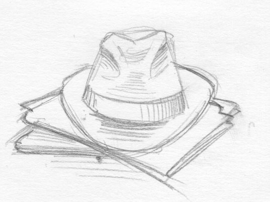
In part two I’ll reveal the sketched idea Jordan sent me and what I think of it.

Getting there

CaseDetective for FogBugz is coming along nicely, there are still a few features to implement, but I’m getting there. It won’t be too long now until I can release a beta. Can’t say for sure what that time frame actually is, but I’m hoping it’ll be before the end of July.

Yesterday I made my first hint that CaseDetective existed in Fog Creek’s FogBugz forum in response to one of the most commonly asked questions; “what about reports?”. Today, in a follow up reply I decided to actually mention CaseDetective’s name, and give a proper URL to where my company site is (http://www.imijsoft.com) and said to contact me if interested in knowing when the beta is ready. I’ve had instant feedback, a couple of people have already dropped me a line via the new website saying they’re interested, and it’s not even lunch time in New York yet :-)

So, now the pressure is really on, I’ve got to get it out the door and into the hands of some people that are actually interested in CaseDetective for FogBugz. It’s kind of scary, but very exciting too.

The horror!

Warning, this picture may make a grown man cry.